ShopDreamUp AI ArtDreamUp
Deviation Actions

Support Kitty Pack
This tier is for supporters who just want to help out while gaining some benefits!
$2/month


Suggested Deviants


Suggested Collections


You Might Like…


Featured in Groups

Description
UPDATE #2: For more progress on this project check out the Snow Sabre Aquave post.
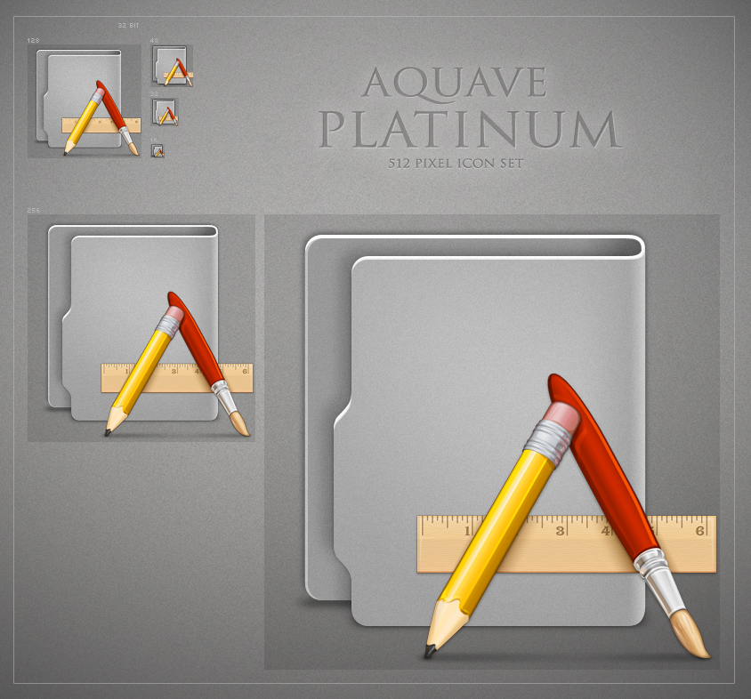
UPDATE: Great news! The world renowned artist Mr. David Lanham has granted me permission to use his wonderfully detailed icon set Aqua from the IconFactory [link] which will play the role of the stylized folder glyphs and so work begins in earnest. And there is now a download here! The download link is a little taste of what these will look like. There are 8 sample icons now. The download has a Mac image with icons, ICNS, and a CandyBar Icontainer as well as Windows ICO files and 512 pixel PNGs of each. Here's a discussion I started over on MacThemes in the WIP forum [link] on this project.
CREDITS: All I am doing here is combing work of other great digital artists so I take no credit whatsoever for this project (unless it ends up sucking and then I'll take full responsibility (Wink) - ;-)") ). All credit must go to Monsieur Laurent Baumann [link] for his now historic Aquave folder design and open-source template available from the Aquave Project. All credit must equally go to Mr. David Lanham and the leading digital design shop IconFactory [link] for the sublimely artistic Aqua icon set [link] used here as stylized glyphs.
). All credit must go to Monsieur Laurent Baumann [link] for his now historic Aquave folder design and open-source template available from the Aquave Project. All credit must equally go to Mr. David Lanham and the leading digital design shop IconFactory [link] for the sublimely artistic Aqua icon set [link] used here as stylized glyphs.
ORIGINAL POST: I know I'm incredibly late to the party but I have recently discovered and subsequently fallen in love with the Aquave Icon Set and the original folder design by Laurent Baumann [link] and I was wondering if there is any interest in reviving the project? This is just a screen shot of what I am working on, I've got about a dozen icons completed. I've taken the original template and updated it in Photoshop CS4 for the Expanded IconFactory IconBuilder 8.5.1 plug-ins. I've added some noise over a grey version of the folders and included a 24x24 icon not part of the original templates. Here are a few of the works in progress (several are not my glyphs and not releasable). But I am wondering if there is any interest in a project like this? Does anyone stil use Aquave and do they want to see it continued? Or is this a dead icon set?
UPDATE: Great news! The world renowned artist Mr. David Lanham has granted me permission to use his wonderfully detailed icon set Aqua from the IconFactory [link] which will play the role of the stylized folder glyphs and so work begins in earnest. And there is now a download here! The download link is a little taste of what these will look like. There are 8 sample icons now. The download has a Mac image with icons, ICNS, and a CandyBar Icontainer as well as Windows ICO files and 512 pixel PNGs of each. Here's a discussion I started over on MacThemes in the WIP forum [link] on this project.
CREDITS: All I am doing here is combing work of other great digital artists so I take no credit whatsoever for this project (unless it ends up sucking and then I'll take full responsibility
ORIGINAL POST: I know I'm incredibly late to the party but I have recently discovered and subsequently fallen in love with the Aquave Icon Set and the original folder design by Laurent Baumann [link] and I was wondering if there is any interest in reviving the project? This is just a screen shot of what I am working on, I've got about a dozen icons completed. I've taken the original template and updated it in Photoshop CS4 for the Expanded IconFactory IconBuilder 8.5.1 plug-ins. I've added some noise over a grey version of the folders and included a 24x24 icon not part of the original templates. Here are a few of the works in progress (several are not my glyphs and not releasable). But I am wondering if there is any interest in a project like this? Does anyone stil use Aquave and do they want to see it continued? Or is this a dead icon set?
© 2009 - 2024 hotiron
Comments27
Join the community to add your comment. Already a deviant? Log In
nice, very nice. .